Voice-First Journaling
and Mood Tracking App
A voice-first journaling and mood-tracking app — built from a personal habit, designed around the way reflection actually happens.
PRODUCT DESIGN -- Own Project - Vibe-Coding Exploration
Scope
Full Product iOS
Deliverables
Mobile App
Approach
PM → CTO Agent → Cursor
Project Overview
MoodFlow came about out of personal exploration and need for a space to capture and translate my thoughts, ideas, insights, emotions, growth and inner dialogues into tangible and comprehensive thoughts.
I'd tried to keep a written journal more than once. Each attempt started the same — blank page, good intention, too much friction. What stuck was talking. Thinking out loud, playing out scenarios, processing a hard week. I started recording those moments in the native voice app on my phone, then listening back at the end of each week to pull out themes, patterns, and things I hadn't consciously noticed.
That habit became the foundation for MoodFlow. Not an app to replace therapy, not a mood score for its own sake — a quiet space to think out loud and have it reflected back in a way that actually means something.
The build used a deliberate three-role collaboration model: I drove product direction and taste as PM and designer, a CTO cofounder agent handled architecture decisions and risk, and Cursor executed implementation. Every feature was broken into scoped phases. Architecture reviews happened before any implementation began. The safety constraints — warm tone, no diagnosis, no directive language — were defined on day one and never relaxed.
Challenge
The core design problem wasn't the UI. It was a set of interrelated constraints that had to be resolved before the product could feel right.
Most journaling apps assume you're a writer. They open to a blank text field and wait. Most mood trackers assume the number is enough — log a 3 out of 5, close the app, move on. Neither model works for people who process best through conversation, movement, or spoken thought. MoodFlow had to accept voice as a genuine first-class input, not an afterthought bolted onto a text-first product.
The pipeline had to be robust end to end. Record → upload → transcribe → summarize sounds simple. On iOS, each step has failure modes: silent mode handling, post-recording audio session state, upload reliability, transcription latency, and graceful degradation. Every step needed to be independently recoverable.
Timezone correctness mattered more than it should. Journal entries belong to days, not UTC timestamps. A recording made at 11:50 PM has to appear on that day's page — not the next morning's. This required explicit occurred_at logic, a fallback chain to created_at, and timezone-offset day window queries throughout.
The AI voice needed a hard edge. Insights are generated by OpenAI. The constraint was non-negotiable: warm, curious, and grounded — never clinical, never directive, never resembling advice from a professional. No diagnosis, no "you should," no references to medication or treatment. This isn't therapy, and the product must never pretend otherwise.
s that existing users already rely on.
Methods
Programs

Cursor
Supabase
ChatGPT
Starting Point
What currently exists in the space and what each app got right and wrong for this use case.
Before any design began or writing a line of code, I spent time with apps already occupying this category. Each one shaped what MoodFlow should and consciously shouldn't be.


Building Process
Small, safe increments — with a clear view of risk at every step.
The build philosophy was deliberate from day one. Each feature was broken into phases, each phase into explicit scoped prompts, each prompt into a scope small enough to test and validate before moving forward. Not because we were moving slowly — but because keeping the system legible meant that when something broke, the surface area was small enough to isolate and fix.
-
Define Workflow Process
-
I describe intent + what “good” looks like.
-
Agent convert to single-shot Cursor prompts or phased prompts if needed.
-
Agent always label steps as:
-
SQL vs Cursor vs Terminal (never mix).
-
-
Agent avoid regressions by restating hard requirements.
-
Debug using logs:
-
Host + status + minimal token prefix only (no full JWTs / no keys).
-
-
-
Define Tone/Therapy Boundaries
-
No diagnosis. No medical/drug advice.
-
No “you should” instructions. No coercive/clinical language.
-
Trauma: tread lightly; no “inner child” pressure.
-
We can provide reflections, patterns, gentle inquiries, and journaling prompts.
-
Never clinical, never political, no profanity, never “you should”
-
Therapeutic frames: mostly ACT + some somatic+stoic+mindfulness/buddhist/spiritual
-
Three roles. One product. Thinking and building kept deliberately separate.
PM / Designer
Direction, taste & constraints
-
Product vision and user goals
-
Feature briefs and acceptance criteria
-
Visual and tonal direction
-
Evaluated outputs for feel, not just function
-
Flagged what worked technically but felt wrong
CTO Agent
Architecture, risk & guardrails
-
Technical proposal review before implementation
-
Data integrity, state bugs, edge case identification
-
Safety constraint definition for AI content
-
Scope creep pushback before it reached Cursor
-
Scaffolding for complex system decisions
Cursor Agent
Implementation execution
-
Scoped prompts → working code
-
UI components from design briefs
-
Supabase queries and Edge Functions
-
Audio pipeline mechanics
-
Structured bug reproduction and iteration

The AI didn't replace the thinking. It compressed the distance between a decision and its implementation.
A feature that might have taken days to prototype could be tested in hours. That compression changes what's possible — but only if the human side of the work is being done with equal care. The judgment, the taste, the constraint-setting: none of that was delegated.
Design Process and Iterations
Every decision traced back to a specific product constraint or user need.
I ran three main tools explorations simultaneously based on the challenges that arose from a JTBD approach looking at my journaling experience and limitations, the trust and comfort I would seek when prompted about my day, and the kind of responses I may want in return based on the type of challenges I face in my day/week stress/work/family/relationship/growth/finances/self/mindset/joyfulness -- calm external insights and thought provoking responses rather than a diagnosis.
Accept voice as a genuine first-class input — not a feature layer
Tool 01 - Journaling/Entry
01
The record button isn't a shortcut to the text journal.
It's a different mode with its own session, its a secondary option, its own state, and its own post-processing pipeline. Recording in progress, upload in progress, transcription, summary — each state is explicit and recoverable. The V1-to-V2 evolution of the recording UI reflects this: what started as a plain stop button became an active listening state with waveform feedback and a warm journaling surface.
02
Design the entry expand pattern to earn the detail — not gate it
Entry previews show a truncated summary on the day hub and home screen. Expanding inline reveals the full summary and transcript without navigating away from the day context. This keeps the day view coherent while making full entry content accessible in one tap.
V1 Voice Journal Recording

V2 Journal Entry Insights


V2 Voice Journal Recording
Name the mood state — don't just score it
Tool 02 - Mood Tracker
01
Named emotional state
A named emotional state with two supporting axes — pleasantness and energy — captures something closer to the actual feeling. Mood Flow uses named states (Motivated, Anxious, Calm, etc.) paired with guided contextual questions that turn a mood check-in from a data point into a brief moment of self-awareness. The screenshot below is a real entry — logged while building the app itself.
02
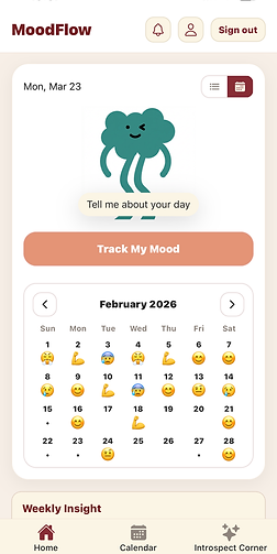
Make the weekly view a feedback loop, not a data dump
The home screen combines a mood strip, weekly insight, and daily insight into a single scroll. The mood strip shows the last four days as named emoji states — not numbers. The weekly insight synthesizes across all entries and mood data to surface patterns that only emerge when you look across time. The goal was for a completed week — filled with mood states, entries, and insights — to feel rewarding to look at.
Mood Detail

Home 7-day Mood

Home Calendar-Mood
Daily Insights
01
Surface the day as the primary unit of meaning — not the entry
Tool 03 - Entry Insights
Individual entries are inputs. The day is the output — a synthesized view of mood, journal content, and a generated insight that pulls it together. The Day Hub became the product's central concept: the place where a scattered set of recordings and a mood check-in cohere into something you can actually reflect on. Getting this right required the timezone work — every piece of content had to land on the correct local day, not the UTC day.
Daily Insight Without Mood Entry

Daily Insight with Mood Entry

VISUAL EVOLUTION
Three versions. Same core function. Increasingly intentional design.
The V1 build was about proving the pipeline. By V1.1, the warm palette and component structure were introduced. V2 resolved the visual hierarchy, added the mascot and mood strip, and brought the Introspect Corner and full navigation into place.
STRATEGIC AND DESIGN INSIGHT
The V1 home screen was never meant to be the product. It was meant to prove the pipeline could work.
Shipping function before form is the right call in early-stage builds — especially when the core value is in the AI pipeline, not the interface. But it creates a debt. The V1.1 and V2 passes weren't polish for its own sake — they were the product becoming legible to someone who wasn't building it.
Iterations and Debugs
The decisions that required the most iteration, and what each one taught us.
Auth flicker — centralizing ownership to a single source of truth. Navigation state and auth state were handled in separate layers in V1. On app load, the UI briefly rendered before auth was resolved — a visible flicker that degraded first impressions and occasionally caused incorrect screens to flash. The fix was centralizing auth ownership entirely: no screen renders until auth state is confirmed. Simple in principle, requiring careful restructuring of the navigation tree in practice.
Timezone day windows — when UTC and "today" are different dates. Journal content belongs to the user's local day, not the server's UTC day. A recording made at 11:55 PM in Chicago is a Wednesday entry — not a Thursday entry. Resolving this required implementing tzOffset day window queries, an explicit occurred_at field on all content, and a created_at fallback chain for older entries. The Cursor session screenshot in the Process section shows this fix being applied across HomeScreen.jsx and DayHub.tsx simultaneously.
iOS audio playback mode — the silent switch edge case. After recording on iOS, the audio session must be explicitly reset before playback works correctly — particularly when the device silent switch is on. Without this, users heard nothing when tapping Play after finishing a recording. The bug only appeared in a specific device state and required reproducing the exact environment: device with silent mode enabled, fresh recording, immediate playback attempt. Isolated to a single audio session configuration step.
Insight refresh logic — dependency-aware regeneration. Daily insights are generated on-demand via Edge Functions. In early builds, stale insights would persist after new entries were added to the same day — the insight had been generated before the new entry existed and wasn't re-triggered. The fix introduced dependency-aware refresh: new entries invalidate the current day's cached insight and queue a background regeneration. Weekly insights refresh on a rolling cadence rather than per-entry, keeping the Edge Function call volume manageable.
From first voice entry to a full product — eight phases.
-
PHASE 1 - Foundation and Auth
-
Expo Router scaffolding, Supabase integration, auth flow, core data schema.
-
-
PHASE 2 - Voice Pipeline
-
Record → upload → transcribe → summarize. iOS audio handling, OpenAI integration.
-
-
PHASE 3 - Typed Journal and Insights
-
Text entry flow, per-entry summarization, Edge Function insight generation.
-
-
PHASE 4 - Mood Flow
-
Named mood states, two-axis model, guided question flow, day linkage
-
-
PHASE 5 - DayHub & Time Zone Fixes
-
Per-day view, occurred_at logic, timezone-correct day windowing.
-
-
PHASE 6 - Homescreen & Cal. Strip
-
Mascot, mood strip with emoji history, weekly insight, calendar navigation.
-
-
PHASE 7 - UI Consistency Pass
-
Theme, spacing, hierarchy reviewed across all screens. Auth flicker and playback mode resolved.
-
-
PHASE 8 - Introspect Corner
-
Tags, Saved/Favorites, Introspect Corner theme gallery, final refinements.
-
-
Next - Polish
-
Clean UI, Interactions, and optimize mood quadrant selector for better use fluidity, and increase number of moods available.
-


What we learned, What we'd carry forward and Next explorations
Good design without measurable outcomes is just aesthetics. These are the metrics that would reveal whether the redesigns achieved their intended business and user value — and how we'd know if they didn't.
Learned and Carry Over
Product
The safety constraint — warm tone, no diagnosis, no "you should" — wasn't a limitation. It was the product. Defining it early gave every feature a clear filter to pass through.
Process
Phased prompts beat open-ended ones, every time. A tight scope with clear acceptance criteria produced better code and fewer revisions than "build the feature."
Process
Architecture reviews before implementation saved significant rework. The CTO agent's role wasn't to slow things down — it was to catch the decisions that were hardest to reverse after the fact.
Design
Taste is still a real product input. The most important calls like spacing, hierarchy, whether an insight lands warmly, couldn't be evaluated with a metric. They required human judgment applied fast.
Collaboration
AI agents accelerated implementation but didn't replace judgment. The human was still responsible for knowing what to build, why it mattered, and whether the output actually worked in context.
Next Explorations
Longitudinal pattern recognition
Monthly and quarterly views that surface recurring themes across entries — the kind of insight that only emerges when you look across time, not just within a week.
Conversational reflection mode
A light back-and-forth mode where the app asks a follow-up based on what you said — not to direct, but to deepen. Thinking out loud with a quiet, curious presence.
Android & cross-platform parity
Expo makes this achievable — but audio session handling and platform-specific UI patterns need careful testing before an Android release feels native.
Shared reflection spaces
An optional, opt-in layer where themes — not entries — can be shared. Less social network, more quiet reading room. Still early thinking.
Building with AI
Is Still Building.
There's a tempting framing for AI-assisted development: describe what you want, the machine produces it. MoodFlow is evidence that this framing is incomplete.
The thinking that makes a product good — the decisions about what to include and what to leave out, the constraints that define the experience, the judgment call about whether an insight lands with warmth or tips into something clinical — none of that was automated. It happened in the briefs, the reviews, the feedback loops, and the moments where something technically worked but didn't feel right.
What AI agents changed was the distance between a decision and its implementation. That compression changes what's possible — but only if the human side of the work is being done with equal care.
The best product decisions weren't made by any single agent. They happened in the conversation between them.